
I chose this brief because I liked the subject matter of dog grooming and the idea she had of the logo being brightly coloured and friendly. I copied the brief into Illustrator to highlight key details and keep her description near to check I am designing something that fits her requests. She had attached some existing logos that she likes elements of; which was very helpful in seeing the design style and tone of her business.
I did try to contact her but she didn't reply - here is the message...

I then researched and collected images of existing dog related logos to get a sense of what is successful and appreciated in the industry. She specified that she was not a fan of cartoon dogs so it is more the shapes and typography I am looking at here - however, I like the dog silhouettes in these logos which she is comfortable with.

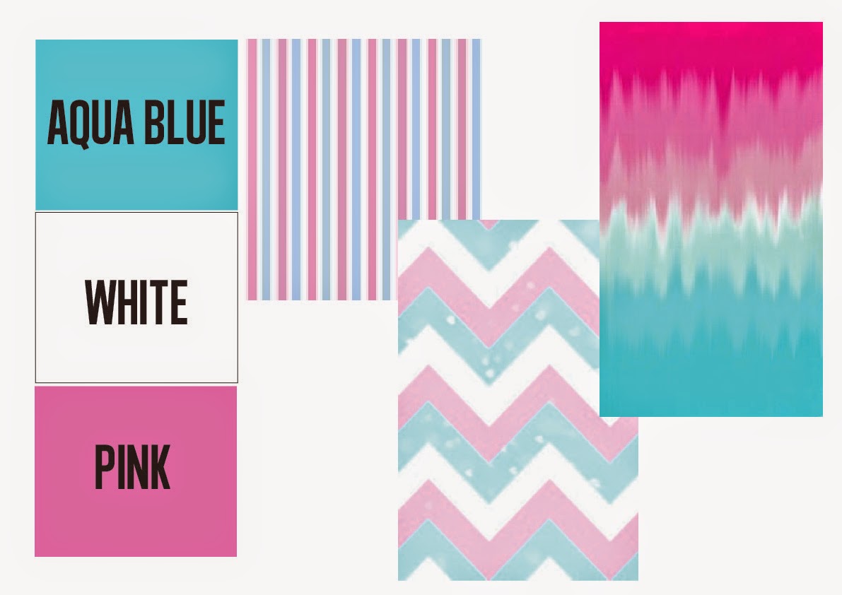
She specified a specific colour scheme of aqua blue, white and pink so I started to look at how those colours can interact...
I then looked at various styles of typography to see what could work for this business...
I wanted something more informal and bold to look inviting and reliable (something she specified in her brief)

I tried out a script typeface using her colour scheme to experiment how I could display the various elements.. However, I think it needs a bolder typeface that can be read from a distance easily. I also tried an enclosed logo in this circular emblem but there is too much confined into the space.

I tried this bold typeface that looks quite informal and friendly. I then filled in some of the letters and placed pink, dog related vectors which she said in her brief that she didn't mind having. I think this is fun, simple and gives the message that it is a dog grooming business that you can trust.

Next I started to experiment more with different dog shape vectors being the background for the type. I really liked the dog being behind the text but the logo on top doesn't fit within the shape so I would like to try out some alternative layouts with this feature.

I experimented with the contours of the shape and the colours of the text but I didn't really like the outcomes because they looked to confined and busy.

I took away the letter 's' and added the tail vector to reinforce the subject of dogs as a part of the logo but I think it needs more dog elements. I then tried a dog in the bath shape but it looks unprofessional and unfinished so I need to rethink this layout - I do like the concept however, as it shows that it is a dog grooming business and not just a business related to dogs.

Finally, I rethought the idea and had a big bath with bubbles that the logo could sit on and the dog's head popping out like he was lying in the bath! I think this shows a fun and friendly image of the business am clearly shows the intentions of the company.

Finished logo submitted to the client...

I also submitted the simplified version that she may also find useful...

Unfortunately, I didn't win but I really like the one that was chosen...

I really like how they have manipulated the letters 'a' and 'l' to show a dog being washed.
Evaluation:
My main design submission of the dog laying in the bath shows the welcoming and light hearted feel to the business that I think she wanted to display whilst the chosen typeface with the paw print shapes add a more simplified look that when subtracted from the main logo can still be a memorable logo design. However, unfortunately I didn’t win the contest but the chosen design is very clever in how they have manipulated the letters to show a dog being showered. I can see why this logo was chosen as it is simple, engaging and fits with the logos that the client included in her brief. I think that my main logo may have been too busy when a logo needs to be compact and clean – this is something that I need to develop on future briefs in order to create a professional design. Throughout this short brief I did a fair amount of on screen development but I think I would have benefited from some very quick thumbnail sketches to experiment with letter shapes. I would grade myself 6 out of 10 because I designed an original and tidy design that I feel suited the brief but it was not concise enough to be chosen as a simple, memorable logo.
No comments:
Post a Comment