Friday 16 January 2015

Brief 1: Winning Whiteladies

This first brief required us to design three different looks for Whiteladies Road's new reusable bag.

Client's brief:
Design an image to go on the side of a reusable bag that promotes Whiteladies Road and the surrounding area.Information: Winning Whiteladies is a project that has been set up to revitalise Whiteladies Road, Cotham Hill, Alma Road, Alma Vale Road, Lower Redland Road, Worral Road and Chandos Road. The project is not just about promoting local businesses, but is about promoting the community spirit and facilities in the local area.The Reusable Bag will be sold within businesses based on and around Whiteladies Road.It should also be noted that in 2015 Bristol is European Green Capital, and as this is a competition to design a reusable bag, this could be reflected in the design.


Initial Research:

To get a feel of Whiteladies Road and the surrounding area I took some photos of some of the shops, signs and streets as I walked them. This would help me to create a design that represents the area and is relevant to what people would find there.

Bag for life research:

I researched some existing reusable bag designs to look at how the message of both the use of the bag (it being reusable - good for the planet) and possibly the area or shop it has come from. As these elements of the design have to interact in order to form a cohesive design it was important for me to see how it has been done successfully. From this I have seen that the environmental element needs to be the more subtle part as the customer will want it to have a stylish design that they would want to carry around.

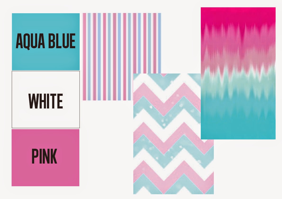
Design style mood board:

I really like the idea of creating a village scene for my bag that shows the energy and character of the area to build up quite a fun and detailed scene for the design.


Design 1: Round bubble shapes

For a more grid like layout I drew out some circle shapes in Illustrator and a found a colour scheme that had the green for the environmental icons and the warm colours of yellow and orange to make an inviting design.


I then added those colours and added some icons that could represent the various shops on in the area.  This design needs a lot more work - especially with the typography as the colour doesn't fit with the deign but I think it is a neat and stylish looking design other than the font.


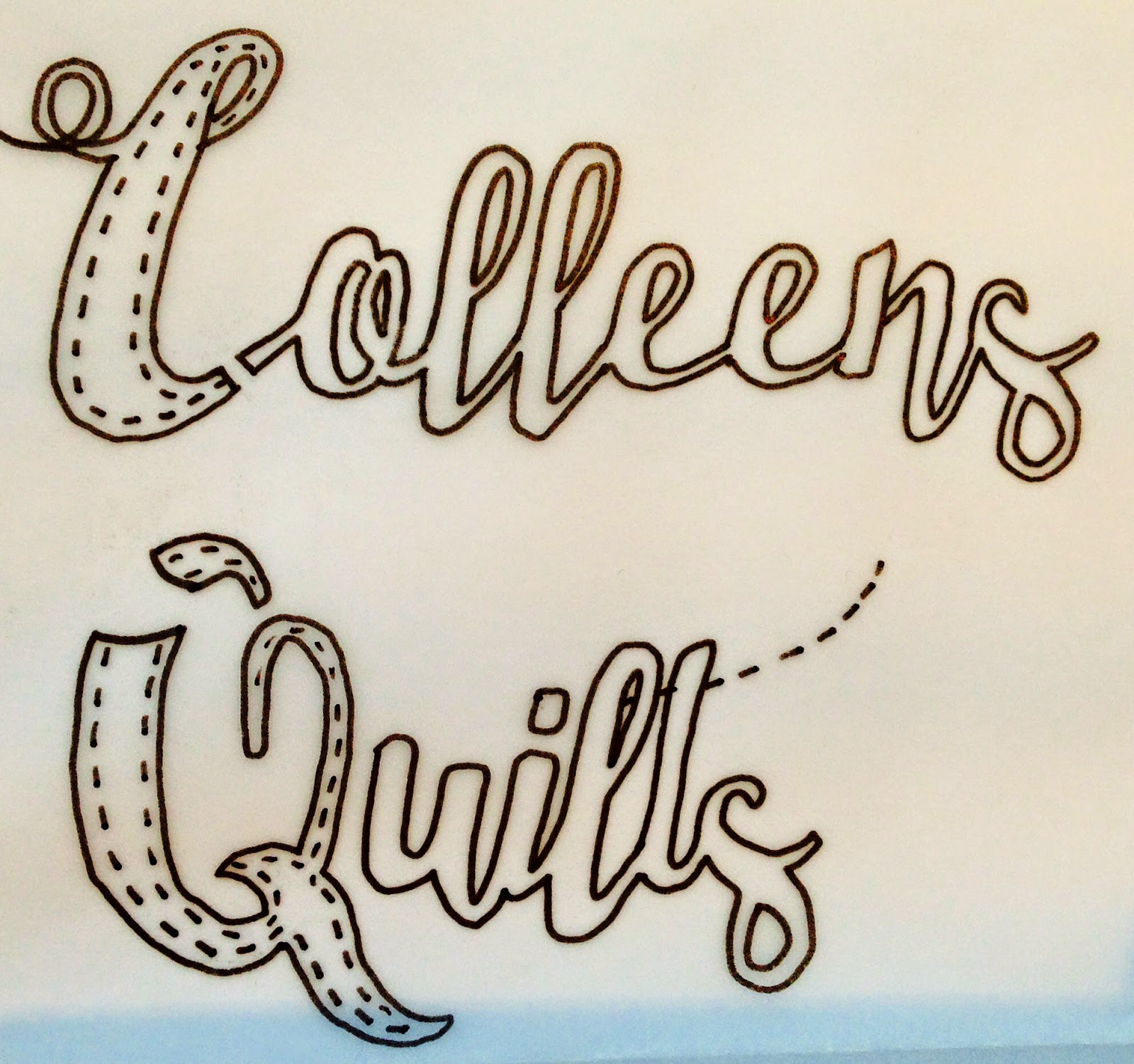
Design 2: Mixed typography

I wanted to create a design that used only typography to reflect the diverse range of shops and services available on Whiteladies Road and the surrounding area. Each word is in a font that reflects that word and I think it builds up quite an interesting look that would catch your eye.


I then tested the same design in different colours to see what could be more successful - I really like the red and the multi-coloured one as they are fun and have more character.

I tested the red version on the bag mock up and found it to be quite difficult to read with the colour and texture of the bag so I am using the black version for now until I can experiment more with the thickness of the type.

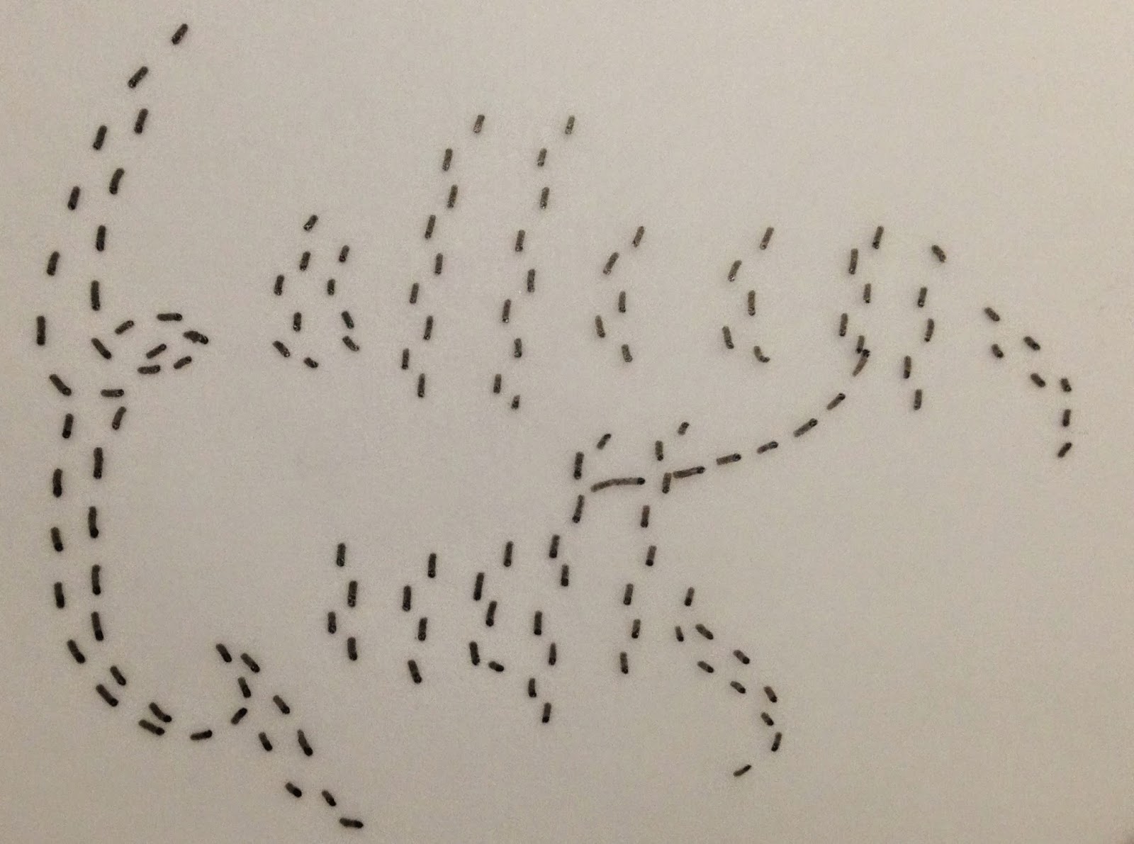
Design 3: Village scene

I sketched out this initial design for my village scene that shows some of the shops and the customers walking down the street. The typography is on a shopping tag and on the shop name signs - they read out a message that relates to the fact that Bristol will be the European green capital next year and so I wanted a message that asked people to keep the city clean but in a nondescript way.

I then took the design onto Illustrator and started to sketch out the shope using the pentel.
I added a fourth shop to the design to spell out 'please keep Bristol clean' and added all of the extra features (windows, doors, trees and brick effects) 


I added a faded edge to the shops to gradually finish them instead of a sudden stop - this makes it look more realistic. I started to add extra features like window displays, recycling bins and changed the typography to suit the theme.

Finally I added some people and the other shop window displays to add some perspective and make it look like a busy and friendly environment.
It still requires a lot of work to give a finished and professional look that I would be happy to be seen but it fits my original design and I think it is a fun and friendly image to represent the area.

Final Designs on bag mock ups:


Peer Feedback (via Facebook):

The typography based design was the winner in the feedback from my peers and they also gave their feedback which will be helpful in adding final touches to the design before submitting them tomorrow.

Although this design was my favourite, I see why it wasn't chosen as it doesn't look finished and could also be considered quite childish or too feminim to suit the wider market. This is the design I spent the most amount of time on and it would require a lot more work to be in a finished state so I think I will be submitting the typography design instead.

Final design to submit for the competition:

I changed the colour of the all of the street names and added the others to bottom to include them in the design. 

Here is the design on the bag mock up

Thursday 15 January 2015

Brief 2: Mobile Dog Grooming Logo

This is the brief I have chosen from the website 'Design Crowd' which lets businesses upload a job to the site for designers to submit their designs.
I chose this brief because I liked the subject matter of dog grooming and the idea she had of the logo being brightly coloured and friendly. I copied the brief into Illustrator to highlight key details and keep her description near to check I am designing something that fits her requests. She had attached some existing logos that she likes elements of; which was very helpful in seeing the design style and tone of her business.


I did try to contact her but she didn't reply - here is the message...


I then researched and collected images of existing dog related logos to get a sense of what is successful and appreciated in the industry. She specified that she was not a fan of cartoon dogs so it is more the shapes and typography I am looking at here - however, I like the dog silhouettes in these logos which she is comfortable with.

She specified a specific colour scheme of aqua blue, white and pink so I started to look at how those colours can interact...

I then looked at various styles of typography to see what could work for this business...
I wanted something more informal and bold to look inviting and reliable (something she specified in her brief)

I tried out a script typeface using her colour scheme to experiment how I could display the various elements.. However, I think it needs a bolder typeface that can be read from a distance easily. I also tried an enclosed logo in this circular emblem but there is too much confined into the space.

I tried this bold typeface that looks quite informal and friendly. I then filled in some of the letters and placed pink, dog related vectors which she said in her brief that she didn't mind having. I think this is fun, simple and gives the message that it is a dog grooming business that you can trust.

Next I started to experiment more with different dog shape vectors being the background for the type. I really liked the dog being behind the text but the logo on top doesn't fit within the shape so I would like to try out some alternative layouts with this feature.

I experimented with the contours of the shape and the colours of the text but I didn't really like the outcomes because they looked to confined and busy.

I took away the letter 's' and added the tail vector to reinforce the subject of dogs as a part of the logo but I think it needs more dog elements. I then tried a dog in the bath shape but it looks unprofessional and unfinished so I need to rethink this layout - I do like the concept however, as it shows that it is a dog grooming business and not just a business related to dogs.

Finally, I rethought the idea and had a big bath with bubbles that the logo could sit on and the dog's head popping out like he was lying in the bath! I think this shows a fun and friendly image of the business am clearly shows the intentions of the company.
I also added the paw prints to reinforce the dog message and allow a simplified version of the logo to still carry the message.

Finished logo submitted to the client...

I also submitted the simplified version that she may also find useful...


Unfortunately, I didn't win but I really like the one that was chosen...
I really like how they have manipulated the letters 'a' and 'l' to show a dog being washed.


Evaluation:

I chose this brief because the tone and style of the business played to my strengths. Her colour scheme of aqua blue, pink and white really appealed to me because I like to use bright colours and vectors in my designs. So this brief would give me the opportunity to do this. She stated how she wasn’t fond of cartoon dogs but most of the logos in my research used cartoon dogs – however, the silhouette shapes of dogs were also popular and I saw this as a stylish compromise to this production obstacle. The client specified that she wanted an appealing, trust worthy logo that was less corporate and more inviting; which her colour scheme lended itself to. Through experimenting with typefaces I found that the bolded fonts suited my design idea and would stand out against any dog vectors I had in the logo. Another issue I had was that she wanted a slogan and a description as part of the logo which would mean there was a lot of text to arrange in a clean way. I used the same font and size for the two sub titles and differentiated them with colour so that they can be legible but don’t distract from the main focal point of the company name. 

My main design submission of the dog laying in the bath shows the welcoming and light hearted feel to the business that I think she wanted to display whilst the chosen typeface with the paw print shapes add a more simplified look that when subtracted from the main logo can still be a memorable logo design. However, unfortunately I didn’t win the contest but the chosen design is very clever in how they have manipulated the letters to show a dog being showered. I can see why this logo was chosen as it is simple, engaging and fits with the logos that the client included in her brief. I think that my main logo may have been too busy when a logo needs to be compact and clean – this is something that I need to develop on future briefs in order to create a professional design. Throughout this short brief I did a fair amount of on screen development but I think I would have benefited from some very quick thumbnail sketches to experiment with letter shapes. I would grade myself 6 out of 10 because I designed an original and tidy design that I feel suited the brief but it was not concise enough to be chosen as a simple, memorable logo.


Tuesday 9 December 2014

Brief 3: Colleen's Quilts Logo

I chose this brief as I wanted to do another logo design as I had picked up some tips from the last brief that I wanted to implement.


I started to brainstorm some potential typography options for the logo to see what styles would be appropriate for her needs and tone of her business.

I then went onto paper and sketched out various typography arrangements and how I could combine visual sewing/quilting elements with the text of the logo...

I decided to use a font from the internet but customise it on paper - this allowed me to alter elements of the letters to appear thicker...


Or have the 'hanging' element she mentioned in her brief...


I also tried to get a dashed 'sewing effect' over the top of the letters so I traced these over the previous writing


I then tried having just the first letters have the dashed lines over it


I then took my scans into illustrator and began to apply her colour schemes and the sewing elements to the text. I learned from the last brief that with logos, the simpler the better as well as seeing from the winning submissions of briefs that clients tend to like when you manipulate an element of the text to show a visual rather than having an external icon. So here I dashed the line that crosses the 't' so it simply shows that sewing element without being too detailed.

I then applied my dashed lines - I feel that this makes it a little too messy and busy.
I did briefly try a 3D version of the logo but it doesn't look appropriate to her requirements.


Final logos that I submitted...


Winning Design (not mine)