Tuesday 9 December 2014

Brief 3: Colleen's Quilts Logo

I chose this brief as I wanted to do another logo design as I had picked up some tips from the last brief that I wanted to implement.


I started to brainstorm some potential typography options for the logo to see what styles would be appropriate for her needs and tone of her business.

I then went onto paper and sketched out various typography arrangements and how I could combine visual sewing/quilting elements with the text of the logo...

I decided to use a font from the internet but customise it on paper - this allowed me to alter elements of the letters to appear thicker...


Or have the 'hanging' element she mentioned in her brief...


I also tried to get a dashed 'sewing effect' over the top of the letters so I traced these over the previous writing


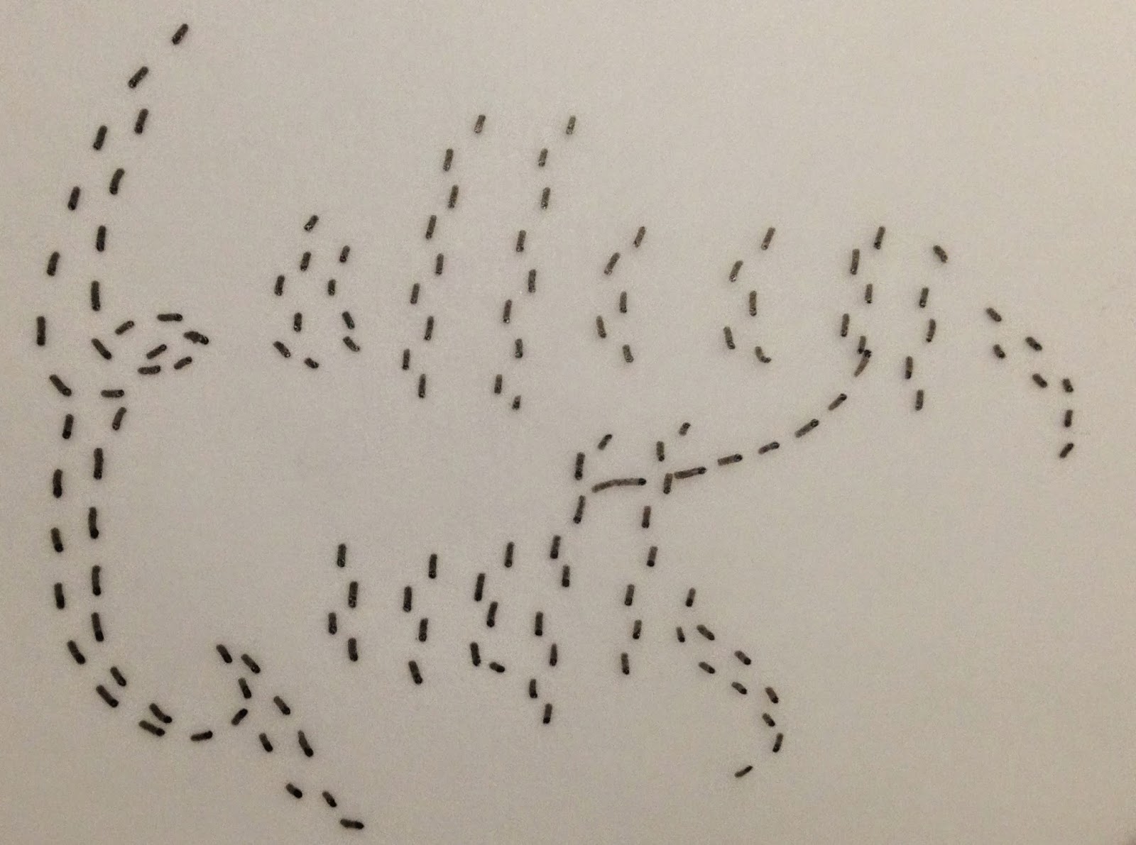
I then tried having just the first letters have the dashed lines over it


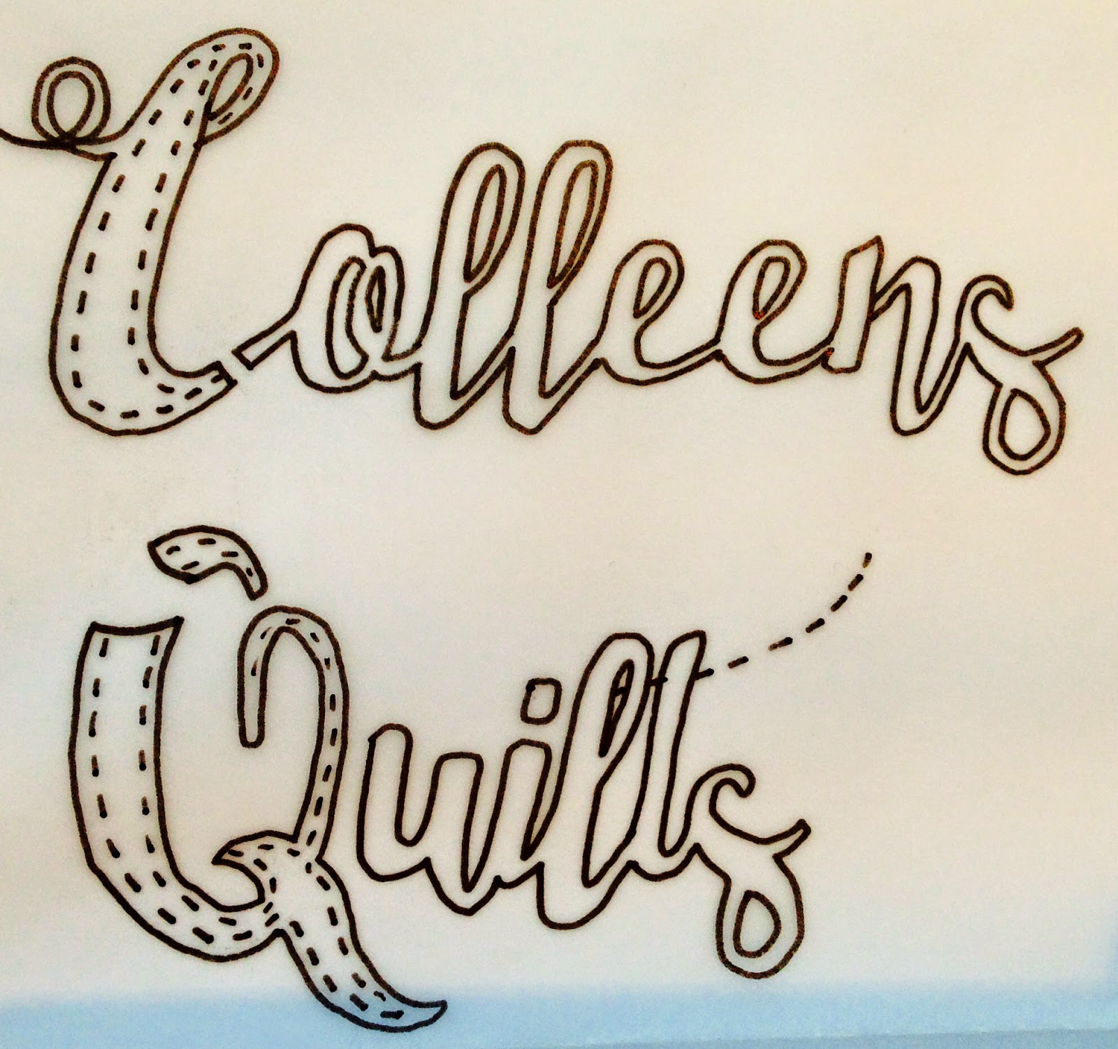
I then took my scans into illustrator and began to apply her colour schemes and the sewing elements to the text. I learned from the last brief that with logos, the simpler the better as well as seeing from the winning submissions of briefs that clients tend to like when you manipulate an element of the text to show a visual rather than having an external icon. So here I dashed the line that crosses the 't' so it simply shows that sewing element without being too detailed.

I then applied my dashed lines - I feel that this makes it a little too messy and busy.
I did briefly try a 3D version of the logo but it doesn't look appropriate to her requirements.


Final logos that I submitted...


Winning Design (not mine)


Monday 8 December 2014

Brief 4: Bakery Subscription Business

I chose another logo design brief because I wanted to continue improving my logo skills and I liked the tone of this bakery subscription business.


I experimented with a few typefaces to see what style/s could work. I liked the more fun ones as the nature of the business is inviting and warm so I want to reflect that in the typography used.

I quickly sketched out some options and really liked the bottom left design and wanted to start developing it on the computer.

I also played around with some vectors and the typography on illustrator to see how I can use the visual elements with the (very long) business name.


I developed my favourite sketch by tracing the image with the pentel to get more precise shapes and cleaner typography. I may have used too many different typefaces for a logo but I wanted something unique and exciting (which is something they specified in their brief) I tested some different colours but my favourite was the red, black and white.


I improved the shape of the cupcake to appear more clean.


FINAL LOGO SUBMISSION (1)

FINAL LOGO SUBMISSION (2)

FINAL LOGO SUBMISSION (3)
FINAL LOGO SUBMISSION (4 & 5)

Sunday 7 December 2014

Brief 5: Kieran Green Photography Logo


Mood board of existing photography logos...

All of these logos have a common theme of looking sophisticated and minimal to not distract from their actual work. I like the use of camera related imagery that subtly link to the aim of the business without being too busy but they have done it in original ways that sometimes use the initials of the photographer.

Camera related vectors...

A visual resource for me to use when sketching my initial designs.


Initial typeface research/experimentation...

I really like the thin stroked fonts that reflect a toned down, serene logo that I feel reflects the images on his website.

Initial sketches and development...


On screen development...

I developed my 'camera flash' idea with different layouts to see potential logo options.

I developed other logo designs from my initial sketches...